Good Afternoon, This week investors are looking at Several economic reports including the fourth quarter domestic product report on Thursday and the big one on Friday which is the Feds favorite report, the personal consumption expenditures price index better known as the PCE. The PCE is bar none the FED’s favorite inflation report. It carries a lot of weight and can be a big market mover during times like these when the FED is watching inflation so closely. Depending on whether is surprises or disappoints the market could significantly rise or fall. Just be aware of it and make sure you check your charts for any significant movement. Two weeks ago Thursday we made a move back into the C Fund. A lot of folks questioned the move at the time as the the C fund had a negative day or two. I don’t think anybody is questioning it now with the major indices setting new records. The thing you must understand about our moves is that we are not trying to time the market. Although we are often accused of being market timers we absolutely are not. We are TREND followers!!!! I say this again for the 100th time!! We are attempting to take advantage of the mid to long term trends. So if you are a day late or so with your transfer don’t be concerned. Life happens. What is important is that you take advantage of as much of the trend as you can. Sometimes you it even be advantageous for you to be late. While we are not timing the market and goes without saying that it is best to be invested to to advantage of the current trend as much as possible. So a day here or there moving your money is not a big deal, but a week or more could be if it is a strong trend. It’s a good practice to make your changes in a timely matter. One more time, we are investing for the intermediate to long term trend. It’s not the end of the world if you miss the 12:00 PM trade deadline. Just enter trade in the afternoon or anytime before 12 noon the next day and your trade will simply take place a day latter. It’s no big deal!
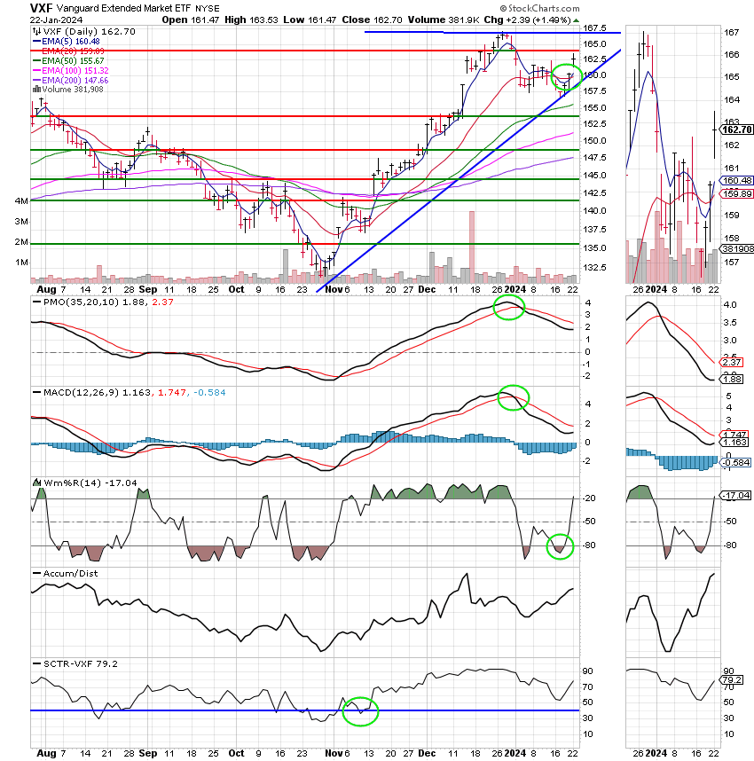
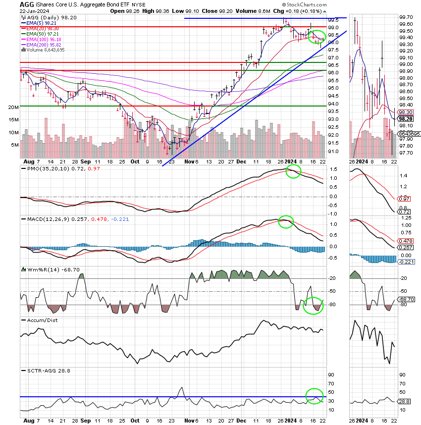
A word about my our analysis. I have to cover this subject every now and then as we get new folks in our group all the time. Invariably, folks will ask what changed. I used to go into detail on every move we made and I spent so much time doing it that my actual analysis suffered and secondly most folks weren’t in interested in technical analysis. When we got into heavy duty technical analysis (especially the math) they just glazed over so to speak. I actually had some folks send messages asking me to include less T/A and more fundamentals, that they just mostly wanted to know where to put their money. I can understand that to a certain degree, they lacked the time or the interest, or the aptitude to do their own T/A. So….. I reflected on how I learned technical analysis and I provided them with the same resources that I had. Occasionally, I delve into things a little more but most of the time I keep it simple. I post the same traditional charts that I used for most of my investing career and still do. I outline the most important changes with fluorescent green circles. The rest is pretty self evident. That is ……self evident if you look at the charts. I don’t care how much formal or informal instruction you may have in technical analysis, you must study the charts for the changes that occur during various market conditions. That is how you recognize what is going on the next time you see it. It’s all about patterns and again, the only way you can recognize them is to look at a lot of charts during a lot of different market conditions. What, I am doing is giving you a base from which to start. Another important thing is that you must understand each indicator you see. While an analyst may tell you that a certain level on a particular indicator is a buy or a sell, does he tell you exactly what that indicator is?? How are you going to understand it if you don’t know what it is, how it is calculated (all indicators are based on math), or what it is designed to measure? How do you use it? Stockcharts.com has a free chart school. All you have to do is enter the indicator in the search bar and it will bring it up and tell you all about it. For example, take the MACD or Moving Average Convergence Divergence. Here is what it has to about the MACD:
and here’s the link: https://school.stockcharts.com/doku.php?id=technical_indicators:moving_average_convergence_divergence_macd
MACD (Moving Average Convergence/Divergence Oscillator)
The Moving Average Convergence/Divergence Oscillator?
Developed by Gerald Appel in the late seventies, the Moving Average Convergence/Divergence oscillator (MACD), due to its simplicity and general effectiveness, is one of the most popular momentum indicators. The MACD turns two trend-following indicators, moving averages, into a momentum oscillator by subtracting the longer moving average from the shorter one. As a result, the MACD offers the best of both worlds: trend following and momentum. The MACD fluctuates above and below the zero line as the moving averages converge, cross and diverge. Traders can look for signal line crossovers, centerline crossovers and divergences to generate signals. Because the MACD is unbounded, it is not particularly useful for identifying overbought and oversold levels.
Note: MACD can be pronounced as either “Mac-Dee” or “M-A-C-D.”
Below is an example chart with the MACD indicator in the lower panel.

How Do You Calculate the MACD?
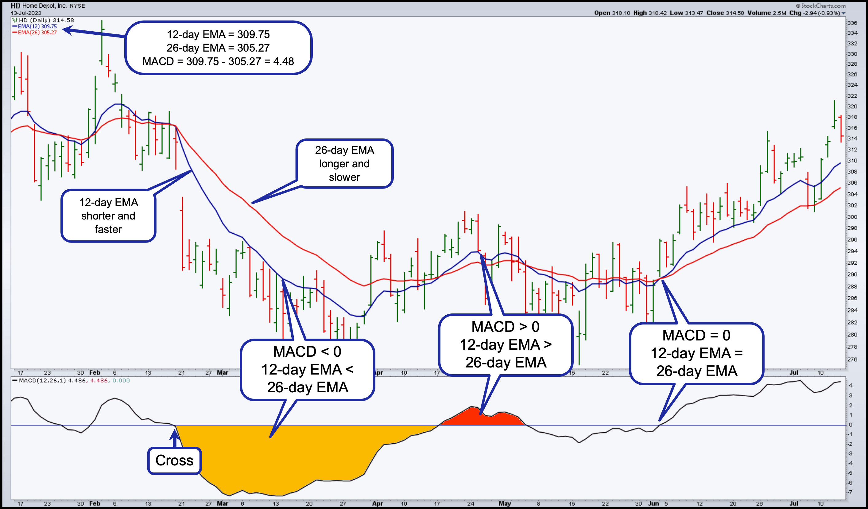
MACD Line: (12-day EMA - 26-day EMA)

Signal Line: 9-day EMA of MACD Line

MACD Histogram: MACD Line - Signal Line
The MACD line is the 12-day Exponential Moving Average (EMA) less the 26-day EMA. Closing prices are used for these moving averages. A nine-day EMA of the MACD line is plotted with the indicator, which acts as a signal line and identifies reversals. The MACD Histogram represents the difference between MACD and its nine-day EMA, the signal line. The histogram is positive when the MACD line is above its signal line and negative when the MACD line is below its signal line.
The values of 12, 26, and 9 are the typical settings used with the MACD, though other values can be substituted depending on your trading style and goals.
How Do You Interpret the MACD?
Convergence/Divergence. As its name implies, the MACD is all about the convergence and divergence of the two moving averages. Convergence occurs when the moving averages move towards each other. Divergence occurs when the moving averages move away from each other. The shorter moving average (12-day) is faster and responsible for most MACD movements. The longer moving average (26-day) is slower and less reactive to price changes in the underlying security.
Oscillator. The MACD line oscillates above and below the zero line, also known as the centerline. These crossovers signal that the 12-day EMA has crossed the 26-day EMA. The direction, of course, depends on the direction of the moving average cross. Positive MACD indicates that the 12-day EMA is above the 26-day EMA. Positive values increase as the shorter EMA diverges further from the longer EMA. This means upside momentum is increasing. Negative MACD values indicate the 12-day EMA is below the 26-day EMA. Negative values increase as the shorter EMA diverges further below the longer EMA. This means downside momentum is increasing.
In the example above, the golden shaded area shows the MACD line in negative territory as the 12-day EMA trades below the 26-day EMA. In mid-February, the MACD moved further into negative territory as the 12-day EMA diverged further from the 26-day EMA. The red area highlights a period of positive MACD values, when the 12-day EMA was above the 26-day EMA.
Signal Line Crossovers
Signal line crossovers are the most common MACD signals. The signal line is a 9-day EMA of the MACD line. As a moving average of the indicator, it trails the MACD and makes it easier to spot MACD turns. A bullish crossover occurs when the MACD turns up and crosses above the signal line. A bearish crossover occurs when the MACD turns down and crosses below the signal line. Crossovers can last a few days or a few weeks, depending on the strength of the move.
Due diligence is required before relying on these common signals. Signal line crossovers at positive or negative extremes should be viewed with caution. Even though the MACD does not have upper and lower limits, chartists can estimate historical extremes with a simple visual assessment. It takes a strong move in the underlying security to push momentum to an extreme. Even though the move may continue, momentum is likely to slow and this will usually produce a signal line crossover at the extremities. Volatility in the underlying security can also increase the number of crossovers.
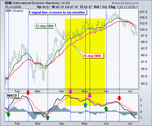
The chart below shows IBM with its 12-day EMA (green), 26-day EMA (red) and the 12,26,9 MACD in the indicator window. There were eight signal line crossovers in six months: four up and four down. There were some good signals and some bad signals. The yellow area highlights a period when the MACD line surged above 2 to reach a positive extreme. There were two bearish signal line crossovers in April and May, but IBM continued trending higher. Even though upward momentum slowed after the surge, it was still stronger than downside momentum in April-May. The third bearish signal line crossover in May resulted in a good signal.
Centerline Crossovers
Centerline crossovers are the next most common MACD signals. A bullish centerline crossover occurs when the MACD line moves above the zero line to turn positive. This happens when the 12-day EMA of the underlying security moves above the 26-day EMA. A bearish centerline crossover occurs when the MACD moves below the zero line to turn negative. This happens when the 12-day EMA moves below the 26-day EMA.
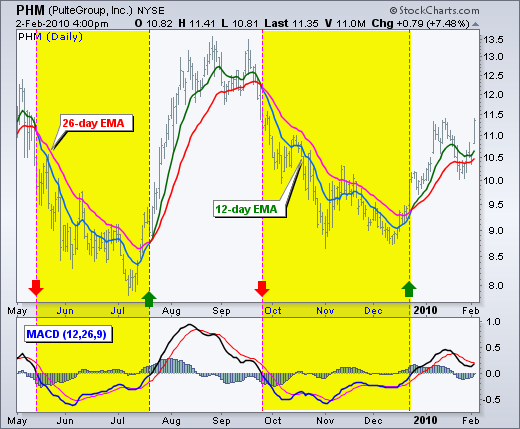
Centerline crossovers can last a few days or a few months, depending on the strength of the trend. The MACD will remain positive as long as there is a sustained uptrend. The MACD will remain negative when there is a sustained downtrend. The next chart shows Pulte Homes (PHM) with at least four centerline crosses in nine months. The resulting signals worked well because strong trends emerged with these centerline crossovers.
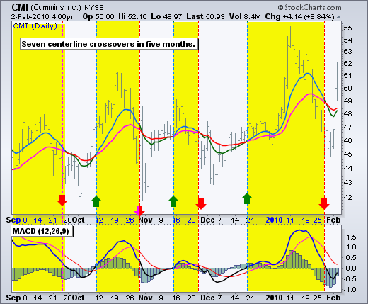
Below is a chart of Cummins Inc (CMI) with seven centerline crossovers in five months. In contrast to Pulte Homes, these signals would have resulted in numerous whipsaws because strong trends did not materialize after the crossovers.
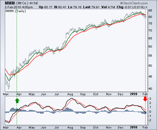
The next chart shows 3M (MMM) with a bullish centerline crossover in late March 2009 and a bearish centerline crossover in early February 2010. This signal lasted 10 months. In other words, the 12-day EMA was above the 26-day EMA for 10 months. This was one strong trend.
Divergences
Divergences form when the MACD diverges from the price action of the underlying security. A bullish divergence forms when a security records a lower low and the MACD forms a higher low. The lower low in the security affirms the current downtrend, but the higher low in the MACD shows less downside momentum. Despite decreasing, downside momentum is still outpacing upside momentum as long as the MACD remains in negative territory. Slowing downside momentum can sometimes foreshadow a trend reversal or a sizable rally.
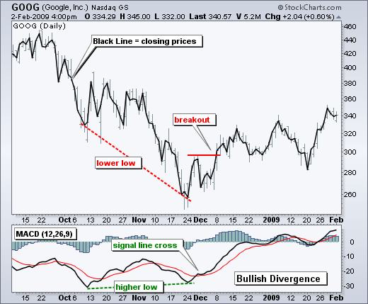
The next chart shows Google (GOOG) with a bullish divergence in October-November 2008. First, notice that we are using closing prices to identify the divergence. The MACD’s moving averages are based on closing prices and we should consider closing prices in the security as well. Second, notice that there were clear reaction lows (troughs) as both Google and its MACD line bounced in October and late November. Third, notice that the MACD formed a higher low as Google formed a lower low in November. The MACD turned up with a bullish divergence and a signal line crossover in early December. Google confirmed a reversal with a resistance breakout.
A bearish divergence forms when a security records a higher high and the MACD line forms a lower high. The higher high in the security is normal for an uptrend, but the lower high in the MACD shows less upside momentum. Even though upside momentum may be less, upside momentum is still outpacing downside momentum as long as the MACD is positive. Waning upward momentum can sometimes foreshadow a trend reversal or sizable decline.
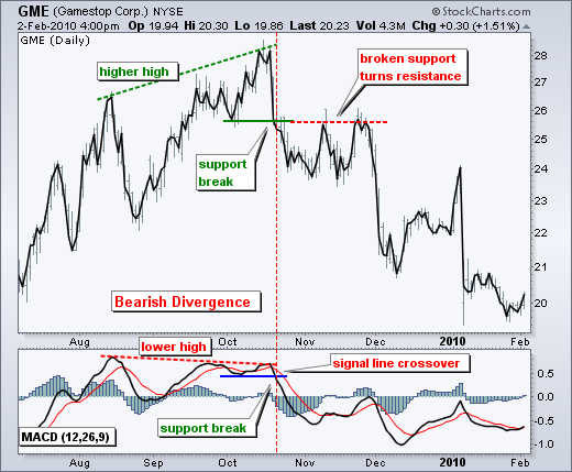
Below we see Gamestop (GME) with a large bearish divergence from August to October. The stock forged a higher high above 28, but the MACD line fell short of its prior high and formed a lower high. The subsequent signal line crossover and support break in the MACD were bearish. On the price chart, notice how broken support turned into resistance on the throwback bounce in November (red dotted line). This throwback provided a second chance to sell or sell short.
Divergences should be taken with caution. Bearish divergences are commonplace in a strong uptrend, while bullish divergences occur often in a strong downtrend. Yes, you read that right. Uptrends often start with a strong advance that produces a surge in upside momentum (MACD). Even though the uptrend continues, it continues at a slower pace that causes the MACD to decline from its highs. Upside momentum may not be as strong, but it will continue to outpace downside momentum as long as the MACD line is above zero. The opposite occurs at the beginning of a strong downtrend.
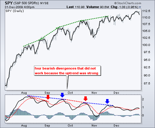
The next chart shows the S&P 500 ETF (SPY) with four bearish divergences from August to November 2009. Despite less upside momentum, the ETF continued higher because the uptrend was strong. Notice how SPY continued its series of higher highs and higher lows. Remember, upside momentum is stronger than downside momentum as long as the MACD is positive. The MACD (momentum) may have been less positive (strong) as the advance extended, but it was still largely positive.
The Bottom Line
The MACD indicator is special because it brings together momentum and trend in one indicator. This unique blend of trend and momentum can be applied to daily, weekly or monthly charts. The standard setting for MACD is the difference between the 12- and 26-period EMAs. Chartists looking for more sensitivity may try a shorter short-term moving average and a longer long-term moving average. MACD(5,35,5) is more sensitive than MACD(12,26,9) and might be better suited for weekly charts. Chartists looking for less sensitivity may consider lengthening the moving averages. A less sensitive MACD will still oscillate above/below zero, but the centerline crossovers and signal line crossovers will be less frequent.
The MACD is not particularly good for identifying overbought and oversold levels. Even though it is possible to identify levels that are historically overbought or oversold, the MACD does not have any upper or lower limits to bind its movement. During sharp moves, the MACD can continue to over-extend beyond its historical extremes.
Finally, remember that the MACD line is calculated using the actual difference between two moving averages. This means MACD values are dependent on the price of the underlying security. The MACD values for a $20 stocks may range from -1.5 to 1.5, while the MACD values for a $100 may range from -10 to +10. It is not possible to compare MACD values for a group of securities with varying prices. If you want to compare momentum readings, you should use the Percentage Price Oscillator (PPO), instead of the MACD.
Here’s our bottom line:
There you have it. That’s one indicator. In about 15 minutes you should have and understanding of whatever indictor you want to learn about. As you can see it gets extensive. That is the reason that I put out the newsletter in the format that I do. Most people prefer it and it gives me time to study the charts and make the best analysis possible or in the case of the last two years adapt to changes in the market. Which leads me to my final subject to the day….. Which is actually the last part of the question about what changes when we issue a new alert.
As you all know if you been reading this blog there were some changes to the market that forced is to make changes to our analysis. Necessity is the mother of invention. I won’t go over that again. You can go to the archives and pull up those blogs. It was painful. So I won’t be rehashing it here. What I briefly what to touch on is some of those changes and how they relate to the analysis. As some of you know we have some very talented folks in our group and we work closely together. How talented? I’d have to say off the scale talented. We have everything from aerospace engineers to computer scientists. They are infinitely talented. Anyway, we got together and designed our own indicators. We designed them to solve the problems we were encountering in the post pandemic market. Let me be clear, when I say we designed them I mean we wrote our own computer code. We designed them (at least some of them) from the ground up. Others, were existing indicators that we modified. They are unique to My TSP Guide. Nobody else has them. They are proprietary and we don’t publish them. In short, I read them and I tell you buy, sell, or hold. We are just now starting to reap the rewards of our work. While we started to put them in place last July, we still had to learn how they behaved. As I mentioned about what you should do earlier, we had to observe them carefully in order to see how they behaved. They were responsible for the nice gains we made in November. They were not responsible for us getting out of the market a little too early in December. That is part of the learning period that I was referring to. As we continue to get better with these indicators our results will improve. They are directly responsible for the gains that you made last week and today. They are the best we have ever seen and we firmly believe they are a blessing from God. Being a benevolent group, we want to share the benefit of these indicat0rs with all My TSP Guide followers. Our service remains free. My point in bringing this all up is that we pass it along to you anytime we get a new signal, but we do not share the indicators that give them. Our desire here is to help people. To pass along the blessings that God has given us. We believe God’s word in that we will reap what we sew. In this case if we sew prosperity then we will reap prosperity. That is good enough for us. While we enjoy God’s blessings here on this earth as much as we can, our main focus is on building our treasures in heaven. Afterall, this world is but a blink in the eye of eternity. We also believe that financial prosperity provides freedom to those who seek God and are appointed to His purpose. Now my final statement on this subject. Our main reason in our decision not to publish these indicators is that there are many unscrupulous folks out there who would seek to make money off our groups work. In other words they would charge for it. This we will not allow. In conclusion, we publish only our traditional charts. So on the rare occasion that you can’t see the change there, then it came from one of the indicators I described above. 95% of the time you will be able to see the changes on the traditional charts. It’s just that we will get the signals a little quicker via the new indicators. So take your time. Study the charts and learn! May God continue to bless all your trades!!
The days trading left us with the following results: Our TSP allotment added +0.22%. For comparison, the Dow gained +0.36%, the Nasdaq +0.32%, and the S&P 500 +0.22%. Praise God for another good day!!
Dow rises more than 100 points to close above 38,000 for the first time ever: Live updates
The days action left us with the following signals: C-Buy, S-Buy, I-Buy, F-Sell. We are currently invested at 100/C. Our allocation is now +0.93%, not including the days results. Here are the latest posted results:
| 01/19/24 | Prior Prices | ||||
| Fund | G Fund | F Fund | C Fund | S Fund | I Fund |
| Price | 18.0011 | 18.9731 | 75.5037 | 75.2076 | 39.3886 |
| $ Change | 0.0020 | 0.0050 | 0.9226 | 0.8649 | 0.0963 |
| % Change day | +0.01% | +0.03% | +1.24% | +1.16% | +0.25% |
| % Change week | +0.08% | -1.10% | +1.19% | +0.21% | -1.57% |
| % Change month | +0.21% | -1.30% | +1.53% | -2.45% | -1.97% |
| % Change year | +0.21% | -1.30% | +1.53% | -2.45% | -1.97% |