Good Morning, Where do I start? November is over. It ended up being the best month of the year so far. Yes, it’s remotely possible that December could be even better. I don’t really think so, but given the conditions it is possible. Why was November so good? Many folks will point to the election as the sole reason, but it was not. There are in fact three reasons with the election being the catalyst that took us over the top. The first and most obvious reason is the season. November and December along with March and April have been the best months for the stock market since they have kept records. I always try to be fully invested during those months if the current market conditions are favorable. The second reason is that we are in the beginning of a new economic cycle. We have exited a cycle of high inflation and increasing interest rates and entered a new cycle of decreasing inflation and interest rates. One thing to note with regard to the Fed’s rate decreasing policy is that an exceptionally strong economy will likely slow those decreases down a bit, but they will not stop them. The market will act disappointed when rate decreases are delayed but we must remain focused on the fact that they will eventually decrease. Thirdly, you have the election. Now you can argue over this until the cows come home but the election definitely provided the spark that lit the tender box. There are two reasons for that the first of which we can all agree on and the second on which we won’t. The completion of the election removed uncertainty from the market and as you know the market hates uncertainty. Regardless of who won the election we were going to get a boost out of that. Second, the market favors President Elect Trumps economic policies. He favors deregulation and the market has always preferred deregulation. An atmosphere of deregulation allows small businesses to prosper. You don’t think so? The Russell 2000 gained over ten percent in November. Couple deregulation with lower interest rates and you have the perfect conditions to grow small business. Add those lower rates to the consumer as well and you have a strong economy that will cause inflation to hang around a little longer than we would have wanted, but that’s the price of having a good economy. Those of you that have lawns could liken it to adding fertilizer to your lawn. It makes the lawn greener and thicker but it also results in the lawn having to be mow it more often. The fertilizer would be lower rates and deregulation. The increased growth in the lawn would be inflation and mowing would be higher interest rates for longer. The bottom line is that healthy economies grow and create inflation. The key is that we don’t allow them to over heat. Thus you have the Fed target of two percent growth for inflation. It allows the economy to grow at a healthy rate without overheating and there you have it!
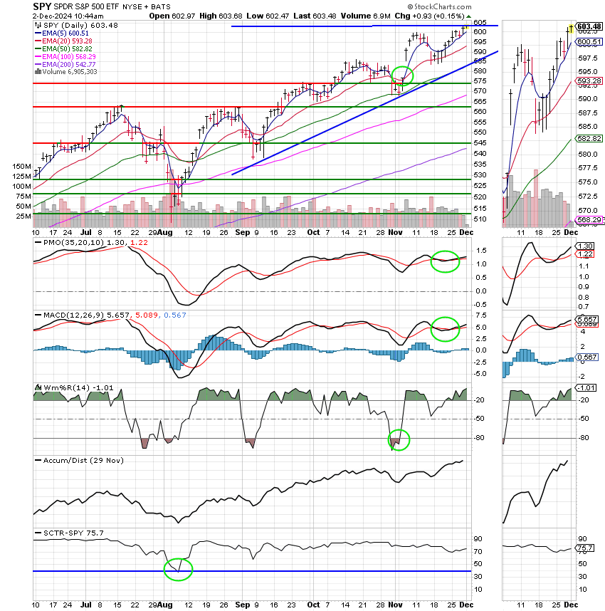
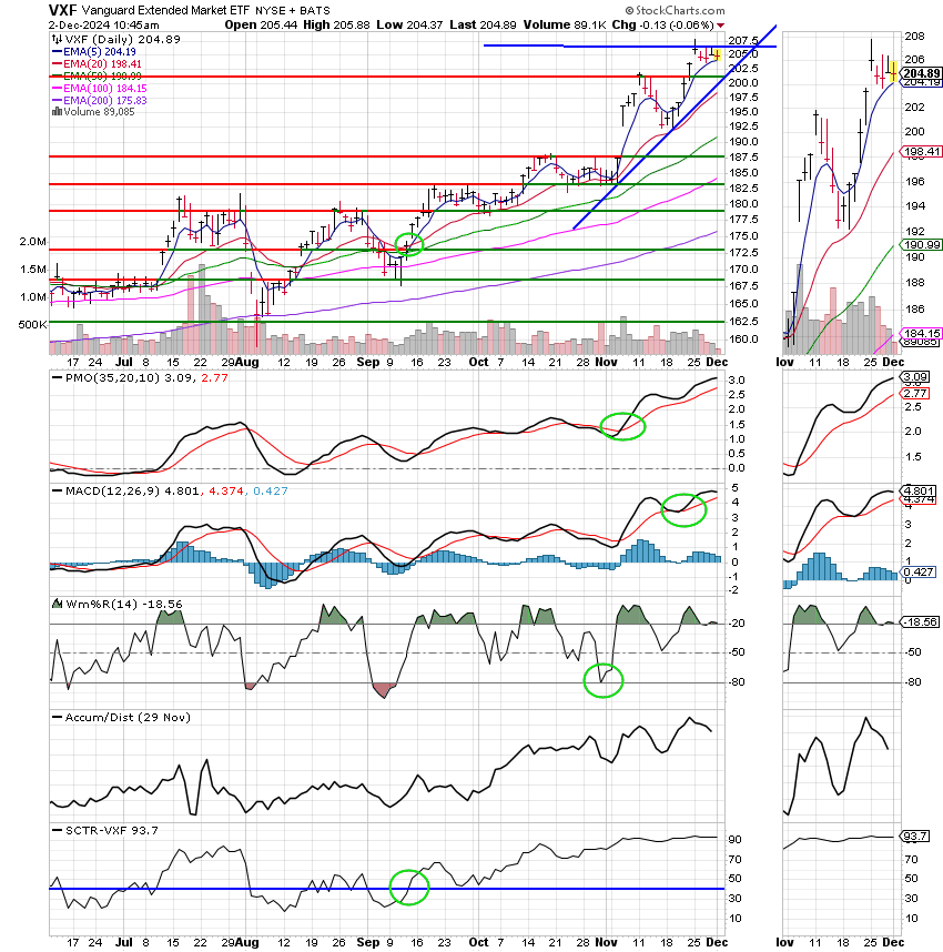
If you read this blog up to this point then you should have already figured out why we are invested at 100/S. It’s because the S Fund has a lot of small caps. So…is that the sole reason we invested in the S Fund? Because of fundamentals?? No, never, not here. We knew that the S Fund could out perform the C and the I funds before we ever looked at the fundamentals. All the Fundamentals did in this case was support what we were already seeing on our charts. You may remember that we discussed the charts when we made the move from the C to the S funds. We talked about one indicator that standing alone told us that the S fund was getting stronger than the C Fund and that was the SCTR or Stock Charts Technical Rank. Do you remember? If not then go back and check as it will help you make decisions in the future with confidence. Currently as it stands the SCTR for the S Fund is a healthy 93.1 while the SCTR for the C Fund is 75.5. That is why the S Fund is the best right now. Understand one thing though. The SCTR can be a little laggy at times. So you always need to make sure the other indicators on your chart are good as well, but given all things equal the SCTR will tell you which chart is the best investment. So how does the SCTR w0rk??? Here is what the Stock charts Chart School has to say about it:
StockCharts Technical Rank
The StockCharts Technical Rank (SCTR) is a numerical score that ranks a stock within a group of stocks. The methodology for these rankings comes from the wisdom of John Murphy, author of many books on technical analysis.
Stocks are assigned a score based on six key indicators covering different timeframes. These indicator scores are then sorted and assigned a technical rank. Using SCTR tables, chartists can sort stocks according to their technical rank, making it easy to identify the technical leaders and laggards within a specific group.
As with all technical indicators, SCTRs are designed to be used with other indicators and analysis techniques. For example, you can use SCTRs as a filter when there are too many signals, weeding out stocks showing relative weakness, and providing a manageable subset for further analysis.
Note that leveraged and inverse exchange-traded funds (ETFs) are excluded from the SCTR rankings for the ETF universe. Above-average volatility and inverse movements skew the results. The VIX ETF (VXX) is also excluded because it moves inverse to the S&P 500.
It takes two steps to calculate the StockCharts Technical Rank (SCTR). First, each stock is “scored” based on six different technical indicators. These six indicators can be subdivided into three groups— long-term, medium-term, and short-term. The box below details these indicators, the relevant timeframe, and the weightings.
Except for the 3-day slope of the PPO-Histogram, the raw numbers are used to calculate the indicator score. For example, if a stock is 15% above its 200-day moving average, then this indicator will contribute 4.5 points to the total indicator score (15 x 0.30 = 4.5). If the 20-day Rate-of-Change is -7%, then this indicator will contribute a negative 1.05 points to the total indicator score (-7 x 0.15 = -1.05).
For the PPO-Histogram, if its slope is greater than +1 (i.e., +45 degrees), 5 points (5% of 100) are contributed to the total indicator score. If the PPO-Histogram’s slope is less than -45 degrees, 0 points are contributed to the score. Otherwise, 5% of ((Slope + 1) x 50) is contributed.
After this first calculation round, StockCharts.com then ranks these stocks by their indicator score. Keep in mind that these stocks are ranked solely within their group, such as large-caps, mid-caps, and small-caps.
This article will first show a simplified example using 10 stocks sorted by indicator score. The stock with the highest score gets the highest technical rank (10), while the stock with the lowest score gets the lowest technical rank (1). The rankings are then filled in according to the indicator score.

StockCharts Technical Rank goes into much more detail. First, the rankings extend from 0.00 to 99.99, with 0 being the absolute weakest and 99.99 being the absolute strongest. No stock will score a perfect 100. Second, StockCharts.com creates “buckets” (akin to percentiles) to sort the stocks within a group.
Using an example with a universe of 500 stocks, 10 equal buckets would be created and each bucket would have 50 stocks (50 x 10 = 500). The 50 stocks with the lowest indicator scores go into the bottom bucket and have SCTRs ranging from 0 to 10. The 50 stocks with the highest indicator scores go into the top bucket and have SCTRs ranging from 90 to 99.99. Each bucket will then be filled accordingly and further sorted within the bucket. The end result is 500 stocks ranked from 0 to 99.99 and spread relatively evenly across the ranking pool.
The indicator score is unique and powerful because it accounts for several timeframes, rather than being tethered to a specific one. A stock must score well with all indicators and all timeframes to earn a top indicator score and technical rank. The indicator score puts more weight on the two long-term indicators, which account for 60% of the total score. This is because the long-term trend is the strongest force. The weightings decline as scoring moves to the short-term indicators. The medium-term indicators account for 30% and the short-term indicators account for 10%. Together, the long-term and medium-term indicators account for 90% of the total score.
The StockCharts Technical Rank shows how a stock is performing relative to its peers, not a benchmark index. Indices, such as the S&P 500, are dominated by large-caps and may not truly reflect the market as a whole. Instead of benchmarking to one index, SCTR sorts all stocks within a specific universe, such as large-caps, mid-caps, and small-caps. In this regard, you can see how, say a stock like Apple is performing relative to Amazon, IBM, and other large-cap stocks.

SCTR tables can easily be sorted to separate the strongest stocks from the weakest. In any given SCTR universe, the top 10% will rank between 90 and 100, while the bottom 10% will rank between 0 and 10. A stock scoring 50 would be average, showing neither relative strength nor relative weakness. In general, scores between 40 and 60 are considered average. Signs of technical weakness start to appear as scores move below 40. Signs of technical strength emerge when scores move above 60.
In order for a stock to have a SCTR value, it must first belong to a “Universe.” Universes are large groups of stocks established by StockCharts.com for the purpose of relative strength ranking. A stock can only belong to one SCTR Universe at a time. Currently, we use country and/or market capitalization to determine which universe a stock belongs to.
Here is a list of the current SCTR universes that we support:
-
Large-Cap. US stocks with a market cap over $10 billion
-
Small-Cap. US stocks with a market cap between $250 million and $2 billion
-
Mid-Cap. US stocks with a market cap between $2 billion and $10 billion
-
ETF. Non-leveraged US ETFs
-
Industries. US industries, represented by Dow Jones US Industry Indices
-
Toronto. Canadian stocks that trade on the Toronto Stock Exchange and have significant market cap
-
London. Stocks that trade on the London Stock Exchange and have significant market cap
-
India. Stocks that trade on the National Stock Exchange of India and have significant market cap
To keep the number of ranked stocks manageable, the meaning of the phrase “significant market cap” changes from year to year depending on the number of stocks that qualify for each universe.
The SCTR Universes are “re-balanced” monthly.
US stocks SCTR universes are defined based on market capitalization. As a result, these universes will not always match, for example, S&P Large-, Mid-, and Small-cap indices. This is because S&P also includes other criteria, such as quality, liquidity, etc., for inclusion in one of these segments.
To prevent stocks from changing into a different universe on every rebalancing because they are hovering around the cut-off levels between the different universes, a stock must qualify for the new universe for a minimum of three consecutive months.
There are two percentage-based long-term indicators.
The first indicator score accounts for a stock’s distance from its 200-day moving average. A stock is in a long-term uptrend when it is above the 200-day moving average and in a long-term downtrend when it is below. The distance from the 200-day moving average line determines the trend’s strength. A strong uptrend is present when price is well above the 200-day. Conversely, a strong downtrend is present when price is well below the 200-day.
The 125-day Rate-of-Change is the second long-term indicator. This simple indicator measures the percentage price change over the last 125 days, which is around six months. Strong stocks will show the largest gains, while weak stocks will show the largest losses. It is a straight-forward indicator designed to measure pure strength or weakness.
The first chart shows Home Depot with the 200-day moving average and the 125-day Rate-of-Change indicator. At the time this chart was created, HD had an SCTR score of 97.4. Price was over 15% higher than its moving average and the Rate-of-Change was above 20%. Such strength in these long-term indicators packs a big positive punch for the technical rank.

The second chart shows Whirlpool (WHR) with the same indicators, but a different technical picture. Note that WHR has a SCTR score of 3.50, which is in the bottom 10%. The stock is trading over 25% below its 200-day average and the 125-day Rate-of-Change is below -30%. WHR recently hit a new 52-week low, which is indicative of a long-term downtrend. This weakness is clearly confirmed by the low technical rank.

The next two indicators cover the medium-term picture.
A 50-day moving average covers around 2 1/2 months of trading. A stock is trending higher when above the 50-day moving average and trending lower when below the 50-day. This positive effect is compounded when a stock trades above the 200-day and 50-day averages. The converse is true when a stock is trading below both moving averages.
The 20-day Rate-of-Change measures the percentage price change over a 20-day period, which is about a month. Again, stocks with big positive price changes over a 20-day period show above-average strength that will be reflected in the technical rank. A big decline over a 20-day period would negatively affect the technical rank.
The first chart shows Home Depot with the 50-day EMA and 20-day Rate-of-Change indicator. Remember, HD had an SCTR score of 97.4 at the time this chart was created. Medium-term, price was over 10% above its 50-day average and the 20-day Rate-of-Change was greater than 9%. Those are mighty strong numbers.

The second chart shows Whirlpool (WHR) with the same indicators, but a completely different technical picture. Remember, WHR had a SCTR score of 3.50 on December 5. The stock was trading over 5% below its 50-day moving average and the 20-day Rate-of-Change was below -2.5%. These numbers are not that drastic and definitely an improvement over the levels seen in late November. However, ranked against other large-cap stocks, these negative numbers did not help Whirlpool and kept its technical rank in the bottom 10%.

The two short-term indicators account for 10% of the indicator score.
First, 14-day RSI is used to gauge short-term momentum. Developed by Welles Wilder, this classic momentum oscillator fluctuates between 0 and 100. High levels (above 60) reflect bullish momentum while low levels (below 40) indicate bearish momentum.
The 3-day slope of the PPO-Histogram is also used to gauge short-term momentum. The Percentage Price Oscillator (PPO) measures the percentage difference between the 12-day EMA and the 26-day EMA of a stock. The PPO-Histogram is the difference between the PPO and its 12-day EMA. In a sense, the PPO measures momentum, and the PPO-Histogram measures the momentum of the PPO. Taking this indicator one step further, the 3-day Slope of the PPO-Histogram measures the degree of change in the PPO-Histogram over three days. The slope is the rise over the run (rise/run), the 3-day change in the PPO-Histogram divided by three. SharpCharts does not have an indicator for this, but a quick look at the charts tells you if the slope is positive or negative. You can also see when the slope is relatively steep or flat. A steep slope reflects a sharp change, while a flat slope reflects a slight change.
The first chart shows Home Depot with 14-day RSI in red and the Percent Price Oscillator (PPO) with its histogram in the indicator window. Keep in mind that HD has a SCTR score of 97.4. RSI shows strength because it was trading above 70 at the time. In fact, notice that RSI was at its highest level in over six months. This strong reading contributed to the high technical rank for HD. The last three bars of the histogram define the slope. There is a sharp rise from the first bar to the third, which is a positive slope.

The second chart shows Whirlpool (WHR) with the same short-term indicators. Remember, WHR had a SCTR score of 3.50. 14-day RSI bounced off its late November low, but remains below 50. Short-term momentum is neutral at best, slightly bearish at worst. The 3-day slope for the PPO-Histogram, however, is positive. Notice that the first bar is in negative territory and the third bar is in positive territory. The rise is not that steep though. This indicates that the 3-day slope of the PPO-Histogram is not contributing that much to the indicator score. Additionally, keep in mind that this indicator accounts for just 10% of the total score.

The StockCharts Technical Rank feature can be accessed from the SCTR Reports page. From here, you can choose your stock universe, opt for end-of-day or intraday data, select columns to display, sort columns, and do further analysis on a stock or ETF.
Note: End-of-day is based on the most recent daily close, while intraday is based on price levels at that particular point in time.
The double arrows displayed on the right of a column indicate the column can be sorted in ascending or descending order. For example, the CHG column reflects the change in SCTR values from one period to the next. Sorting by this column will display the stocks with the biggest changes in their technical rank. This feature is helpful to spot the big movers.
Leveraged and inverse ETFs are excluded from the SCTR rankings for the ETF universe. Above-average volatility and inverse movements skew the results. The VIX ETF (VXX) is also excluded because it moves inverse to the S&P 500.
Click here to see the StockCharts Technical Rank page live.

The StockCharts Technical Rank (SCTR) separates the wheat from the chaff. Relative strength is an important part of a successful trading or investing strategy. Based on the wisdom of John Murphy, SCTR allows chartists to compare the technical strength of one stock against all the stocks in its peer group. Chartists can also group stocks according to the technical rank. Stocks in the top 30% will have a technical rank of 70 or higher.
Chartists can then focus on these relatively strong stocks for potential long positions on pullbacks. Conversely, chartists can use the technical rank to avoid weak stocks, such as those with a technical rank below 40. As far as new trends emerging, chartists can look for stocks with technical ranks moving out of the middle zone (40–60). A move above 60 would show relative strength improving, while a move below 40 would show an increase in relative weakness. As with all technical tools, SCTR should be used in conjunction with other aspects of Technical Analysis.
Okay, You all wanted Technical analysis well this is it. I will add that the above explanation is from the Stock Charts School which is free on the link that I provide in this blog every week. If you want to do this stuff for yourself that is a good place to start.
Alright, lets move on…..
The days trading has so far generated the following results: Our TSP allotment is trading higher at +0.21%. For comparison, the Dow is slipping -0.31%, the Nasdaq is up +0.81%, and the S&P 500 is adding +0.14%. Paise God for the good run we are having!
Nasdaq jumps to record as Intel and Tesla leap higher; S&P 500 gains slightly.
Recent action has left us with the following signals: C-Buy, S-Buy, I-Hold, F-Hold. We are currently invested at 100/S. Our allocation is now +22.61% for the year and our monthly return for month of November was +11.98%. I’ll take it! Praise God for that!! He is good everyday in everyway! Here are the latest posted results:
| 11/29/24 | Prior Prices | ||||
| Fund | G Fund | F Fund | C Fund | S Fund | I Fund |
| Price | 18.6861 | 19.8166 | 95.205 | 96.9849 | 43.1145 |
| $ Change | 0.0068 | 0.0868 | 0.5404 | 0.2625 | 0.3778 |
| % Change day | +0.04% | +0.44% | +0.57% | +0.27% | +0.88% |
| % Change week | +0.10% | +1.47% | +1.08% | +0.76% | +1.08% |
| % Change month | +0.36% | +1.14% | +5.87% | +11.97% | -0.01% |
| % Change year | +4.03% | +3.09% | +28.03% | +25.80% | +7.30% |